Do you wonder what makes one ad look modern, cool and contemporary while another looks stale, dated and even boring? Choices made by designers can make or break your marketing and advertising efforts. There are simple words floating around today that describe what people are responding to in design: FLAT. SIMPLE. INTEGRATED. ANIMATED. HOMESPUN. MOBILE. RESPONSIVE. These are words that are defining design right now and into the future. If you keep these trends in mind when reviewing your company’s creative efforts, you can be more confident that you are paying attention to what looks good by today’s standards.
The following are some snippets to keep in mind:
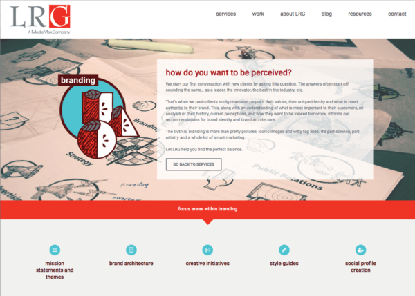
- People are responding to a more graphic, illustrated and stylized look, which brings with it an earthy and familiar warmth. There’s a desire for homespun, artisanal, comfortable and crafted design feels. For logo design, that means approachable marks with feeling. Logo designs are incorporating more modern, timeless styles with the best parts of vintage, craft logo design. There is also movement toward traditional illustration with paper and paint — or at least looking like it. In keeping with artisanal, crafted and homespun styles, hand drawn fonts remain popular.

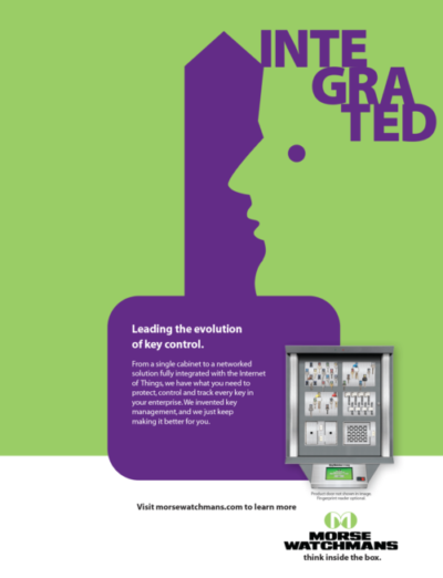
- Flat design remains popular because it works, especially as we continue to view things through mobile, responsive design. It is functional and avoids confusion. Regarding flat design, there are some new design elements that Google has introduced, called “Material Design” that still keep the design flat, but add some dimension. Using perspectives, shadows, and movement, they create a more realistic environment within the flat style so needed for responsive mobile design. Designers are using less color, stronger color, and bolder use of color — allowing the product, photo or video to carry the weight of the visual communication. Color is used to create a consistent experience. Minimal and simple color use, avoiding background gradients creates a modern look.

- More animation is used on websites. Not only animations filling the void left by the absence of FLASH with the loading screens and intros, but more importantly, animations that are thoughtfully used to communicate meaningful user interface. HTML5 and Javascript animations will continue to mature, enabling this trend. Interface and user experience design command more design time with the need to take command over animating and or mocking up transitions. Animated GIFS will be used everywhere including infographics and advertisements. Nothing remains static. Not even logos. From the onset of creative thinking, consideration needs to be given to the logo being animated in some form or another. Will it be a GIF? How does it appear as an icon? Will it become an emoji? These moments of brand expression are considered right from the start. Furthermore, animated documentaries are more important. They take advantage of social media and the user’s desire for explanation. The success of recent animated docs by StoryCorps Vox and TED Ed have paved the road for more mainstream use of the genre.

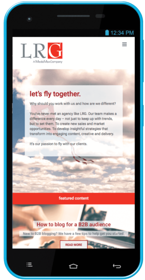
- Mobile and social media are increasing the demand for clean minimalism. These influencers will affect every aspect of design including print, which is here to stay as it moves into the role of supporting the digital experience. Responsive design is key as more and more people are viewing websites on mobile devices. With the simpler style that responsive design demands, subtle interactions become more important. Hover effects, button animations and menu takeovers create a more interactive experience for the user. Designing above the “fold” is less important as people adjust and expect to scroll more with mobile and responsive design. More people would rather scroll than click. And now there are many more scrolling features which allow for a more dynamic experience. Mobile will surpass the desktop as the primary way we access web services. A mobile-first mindset will be a requirement for web projects. Obsessive mobile use means our model for web behavior must change. A user’s journey to find information is now made up of a series of short bursts of browsing behavior. Understanding how a collection of non-linear interactions define a user’s path is essential to designing meaningful experiences moving forward.

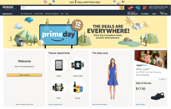
- User experience is at the forefront of product and service development. Strong UX is a key differentiator. The need is essential and its impact is substantial as there is a growing awareness of the subtle ways that interfaces and designed interactions modify or manipulate behavior. Attention to detail, especially transitions, for the user is more important than ever as is strong strategic thinking that is directly integrated with creative thinking and execution from the very beginning of a project. Amazon.com is widely recognized as a website with one of the best user experience and interface designs.

These 5 tips are simple to keep in mind when approaching all your marketing and advertising efforts. LRG is here to support you and make sure your brand is up-to-speed! Feel free to contact us for a consultation to see what we can do to polish your image. Call us at 845.358.1801 or reach out to us online at lrgmarketing.com.


